Discovering the 1963 Tahiti Bicycle Advertisement: A Vibrant Tribute to Cycling
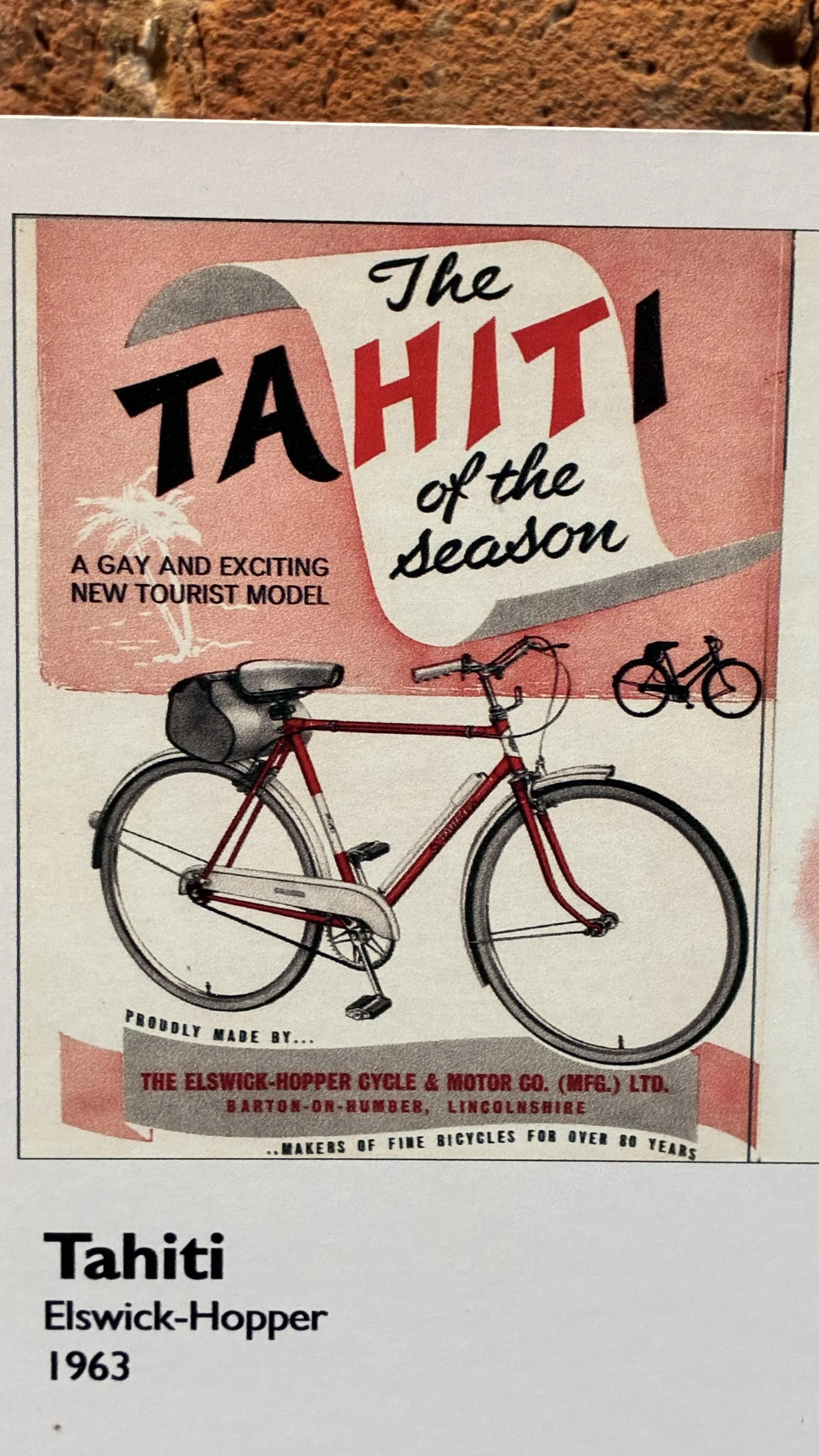
I came across this fantastic poster while visiting the newly revamped café in the old stables of Baysgarth House Museum. The café features a section showcasing some of the bicycles made by the Elswick Hopper factory, which once thrived right here in Barton upon Humber. This replica of the original poster serves as a fun reminder of the joy cycling brings and highlights the town's rich bicycle-making history.
Eye-Catching Colours That Grab Attention
First off, the colours in this advertisement are striking. The bright red bicycle pops against a soft pastel background, creating a lively and inviting atmosphere. This colour scheme not only looks appealing but also evokes feelings of happiness and adventure, perfectly aligning with the spirit of cycling.
Fun Typography That Engages Readers
The typography is another highlight of this advertisement. The phrase “The Tahiti of the season” feels like an invitation to hop on a bike and explore. The playful font adds a sense of fun that appeals to anyone looking for a leisurely ride. Additionally, describing it as “a gay and exciting new tourist model” makes it sound like the perfect companion for summer adventures.
Visual Appeal of the Tahiti Bicycle
The illustration of the bike itself is well done, showcasing its sleek design while remaining friendly and approachable. It balances functionality with style, assuring potential buyers that they are getting a reliable ride without sacrificing aesthetics.
Evocative Imagery of the 1960s
This advertisement captures the spirit of the 1960s, a time when bicycles symbolised freedom and adventure. The combination of the bike and the name “Tahiti” conjures images of sunny vacations and relaxing rides through scenic routes, making it easy to envision the fun you could have.
Engaging Layout That Draws You In
The layout effectively captures attention. With the bike front and centre, surrounded by exciting text, it invites viewers to learn more. Furthermore, the mention of the trusted Elswick-Hopper brand adds credibility, ensuring buyers know they are considering a well-established product.
Conclusion: A Timeless Appeal
In summary, the 1963 Tahiti bicycle advertisement is a brilliant example of effective design and marketing. It uses colour, typography, and imagery to create an inviting and exciting narrative about cycling. This advert serves as a delightful reminder of the timeless appeal of bicycles. Whether you are a cycling enthusiast or simply appreciate good design, the Tahiti advert is sure to spark some wanderlust and inspire you to hop on a bike and hit the road!
